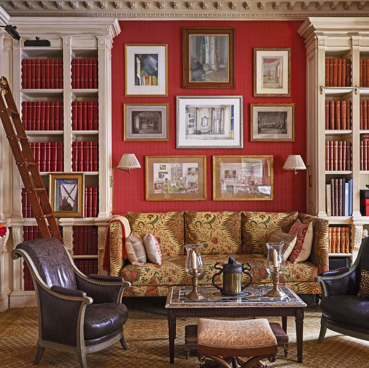


Paint pro and color expert Annie Sloan shares how to bring this dramatic hue into your home.
Nothing infuses energy into a living space quite like a radiant shade of red. The ultimate power color, red stirs up an emotional response—like passion from rich ruby, warmth from deep crimson, or vitality from striking scarlet. Not as serene as green or as beloved as blue, this fiery hue tends to strike controversy among design enthusiasts. But for a color that’s known for bringing the drama, what else should we expect?
Perhaps you’re taking a bold approach to decorating with red, like dousing a living room in delicious cherry, or testing the waters with crisp cardinal accessories. Selecting the right complementary colors is the key to achieving a well-balanced scheme, according to color and paint expert Annie Sloan, the creator of Chalk Paint.
“The color red has impact and va-va-voom. We’re instinctively programmed to respond to this shade,” she says. “It’s the color of confidence—think: red lipstick, fire engines, and ripe summer berries. What’s not to love?” While red can pair with a multitude of colors, the designer would refrain from mixing it with yellow (they’ll fight for the spotlight!). To assist with your brimming decorating ideas, Sloan offers more of her best advice for incorporating the rainbow’s most courageous color into your home. Here, the four best colors that go with red.
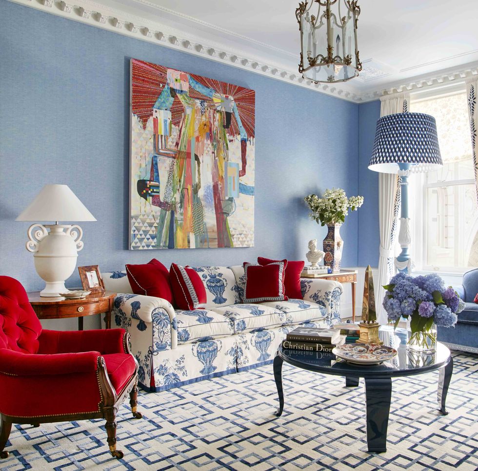
“Harness the energy of this dynamic, delicious, sexy shade by pairing it with cool colors for maximum energy. You’ll be surprised how popular this strong color pairing was in Victorian and Regency times,” says Sloan, who suggests pairing a rustic, earthy red paint (like Primer Red) with crisp blue accents.
In his Manhattan apartment, designer Anthony Baratta enlivened his sky-blue living room with sumptuous red accents for an elegant, all-American look.
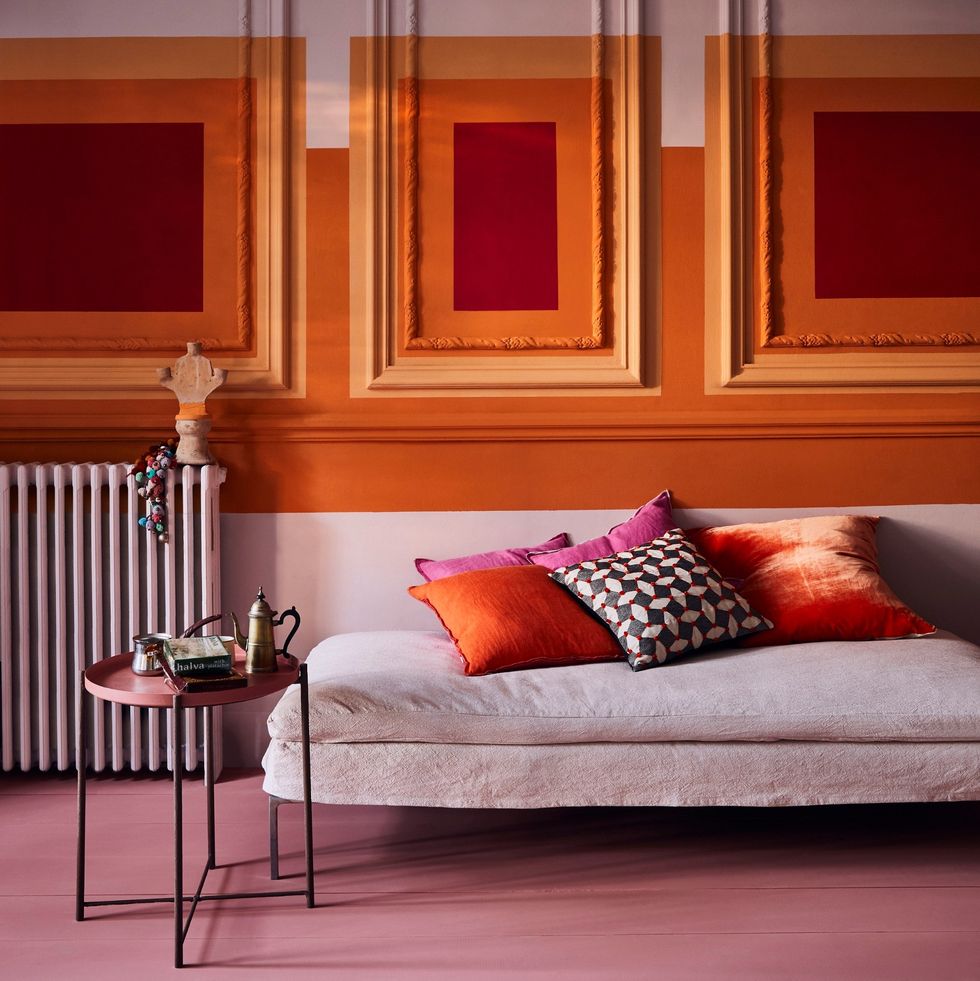
Look to the left and right of red on the color wheel for red's complementary tonal shades—orange and pink—for a contemporary result.
“The combination of these colors allows for a spicy color drench,” says Sloan. Here, a geometric mural created with soft pink Antoinette, vibrant Barcelona Orange, and bright Emperor’s Silk paints from her collection.
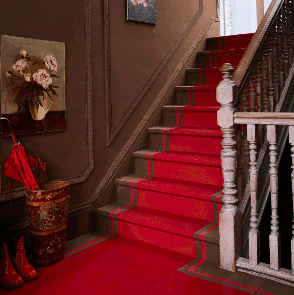
“Those who prefer more understated, traditional schemes should think about using bright reds alongside rich browns for a compelling, indulgent, sophisticated moment,” Sloan says.
A scarlet “runner” painted onto a staircase and landing ignites this cozy chocolate brown pass-through space.
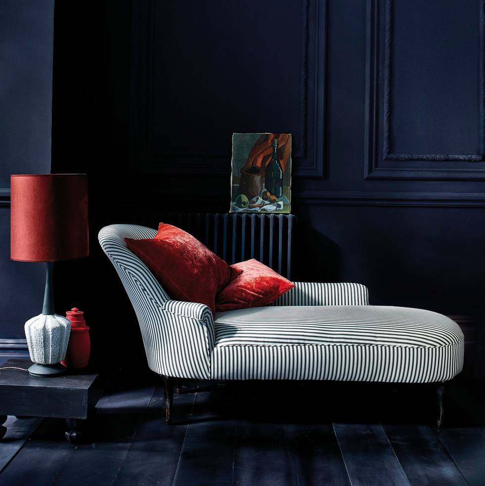
“Dip your toe into reds by adding flashes throughout a room. This color is so impactful that a little goes a long way, which makes it the perfect pick for painting lampshades, photo frames and adding line work to furniture,” Sloan says.
We’re familiar with how effective a scarlet lip and blood-red manicure are with a monochrome outfit; it’s the same principle in your home. When using red, try to avoid too many other colors, or the end result will be over-stimulating, chaotic, and even headache-inducing,” says the designer, who cheered up a moody main living area with smaller pops of saturated red accents.